Animating a Columns block is not the same as animating its Columns one after another. A Buttons block is not an individual Button. A List is not a List Item. These distinctions are useful, not inconvenient: they let you choose whether motion belongs to a collection, one child or the content inside it.
Gutenberg Motion follows the selected block’s context. This guide explains how to choose the target, where sequencing belongs, and how to avoid duplicate motion when patterns or nested layouts add more layers to the document.
Start with the movement you want to own
Use List View before enabling motion. Imagine a section with three cards, each containing a heading, paragraph and button. You might want the entire section to settle into place, the three cards to enter in order, or only the buttons to respond on hover. Those are three different placements.
A parent animation moves the parent and its contents as one visual unit. A direct-child animation resolves a set of immediate children. An individual child placement belongs to that child. Text splitting goes inside compatible text content instead of changing the block hierarchy.
Choose the smallest useful owner
| Intent | Select | Target to inspect |
|---|---|---|
| Move a section as one unit. | Its Group or other supported layout block. | Whole block or container target. |
| Reveal three Columns in order. | The Columns block. | Its Columns collection or supported direct children. |
| Give one call to action hover feedback. | That individual Button. | The button’s supported content target. |
| Reveal all sibling buttons together or in sequence. | The Buttons block. | Its Buttons collection. |
| Reveal list entries in order. | The List. | List items, with explicit care for nested lists. |
| Move one phrase word by word. | The Heading or Paragraph containing it. | Compatible text content, Animate As Words. |
List and List Item have different jobs
Whole-list motion moves the entire list as one target. List-item targeting creates multiple resolved targets, so a placement can sequence entries where its playback controls support that choice. Selecting one List Item instead gives that item its own motion record.
Do not flatten nested lists accidentally
Consider a list of services with a nested list of deliverables inside each service. The top-level list and its immediate entries are one collection; the nested deliverables are another. A broad custom selector such as li can match descendants at several depths, while the native collection profile is intended to identify its own level.
Start with the contextual collection target. Inspect the actual result before reaching for a custom selector. If a nested list needs an independent sequence, select that list and configure it separately. Moving a parent list item also moves its nested content visually; it does not mean that each nested item now owns a separate trigger.
A list item can also contain text targets
Text choices belong to the content available in the selected context. Links and emphasis refer to actual inline markup. Words or characters split compatible text. They are not substitutes for resolving several list items. Choose item sequencing for a collection and text stagger for the reading rhythm within an item.
Buttons owns the collection; Button owns the interaction
Use the parent Buttons block when several buttons should enter together or one after another. Use a child Button when its link should respond to hover, click or focus. The collection’s layout settings still control alignment and wrapping; motion does not replace those settings.
A useful two-layer button recipe
- Select Buttons and attach a compatible entrance to its collection target.
- Use one viewport event source for the collection if the buttons belong to the same visible group.
- Add a short selected-target sequence only if the buttons should arrive in order.
- Select one Button and give it a separate, restrained hover or focus response if needed.
- Save and check normal link behavior, keyboard focus and touch usage on the frontend.
The entrance and interaction should not fight over the same opacity or transform at the same moment. A click animation must not make navigation unpredictable. A hover effect must not be the only way to find the action on a phone. Keep the button readable and usable before, during and after the effect.
Columns, Column and Group: inspect the actual children
The direct children of Columns are normally Column blocks, not every heading and button inside them. The direct children of a Group depend on how you built that Group. If it contains one Columns block, selecting Group’s direct children can resolve one target, not three cards.
Sequence three cards without rebuilding the preset
- Open List View and locate the parent whose immediate children are the three intended cards or Columns.
- Enable motion on that parent and choose a compatible preset.
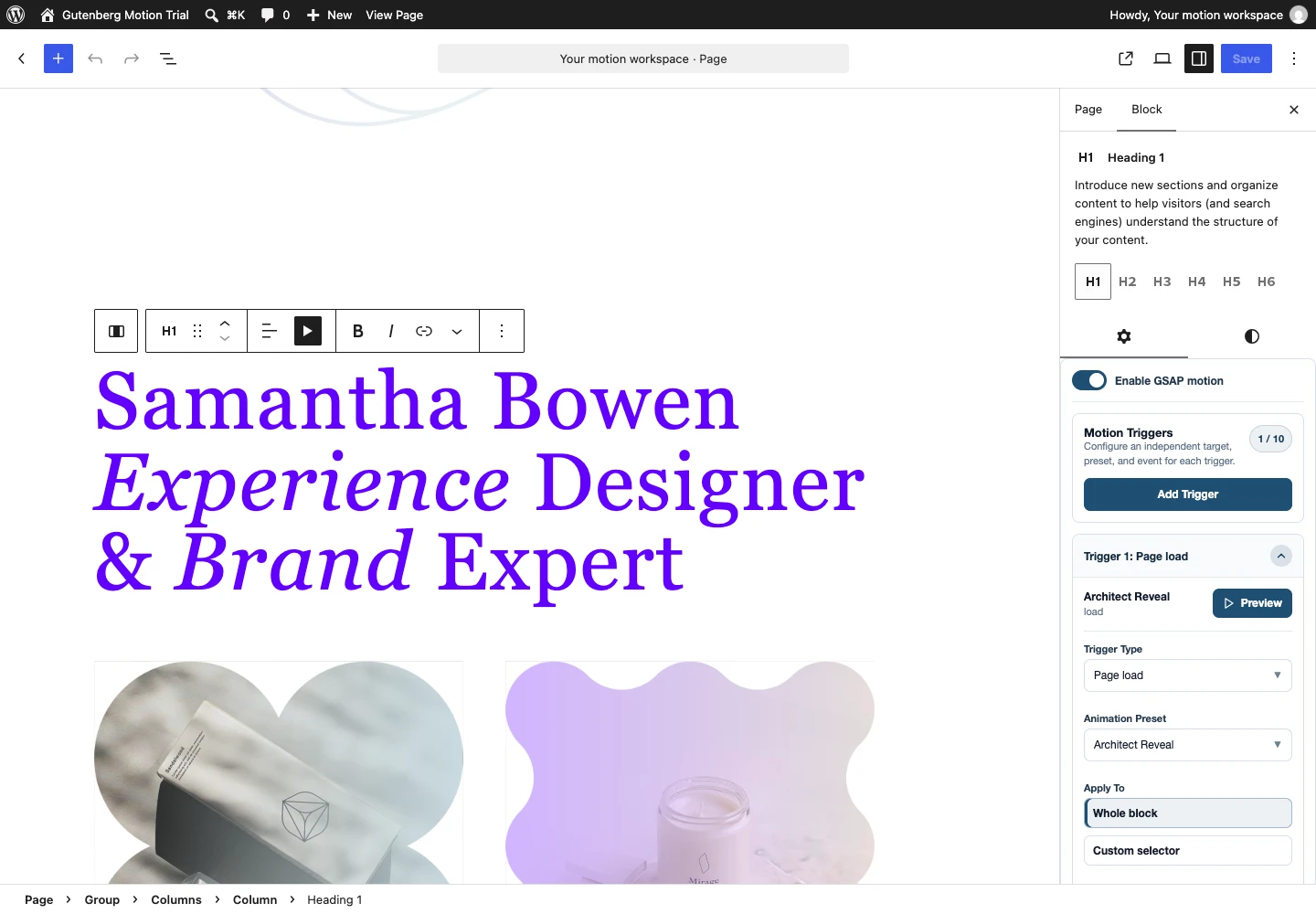
- Select the contextual collection or Direct children under Apply To.
- Set the intended trigger source. A common boundary starts the group together; each-target sourcing, where available, waits for individual targets.
- Enable Selected Target Playback sequencing where exposed. Begin with a small interval and inspect the last child’s arrival.
- Save and verify desktop ordering, mobile wrapping and reverse scrolling.
On mobile, cards often become a vertical stack. A sequence that feels tight in one desktop row can leave the last mobile card waiting too long. Consider a shorter interval or target-specific viewport entrances if the cards are no longer visible as one group.
Preset stagger and placement sequencing are separate timing layers
Stagger belongs in the preset when it is part of the reusable motion’s internal design. Selected-target sequencing belongs in the placement when it is about distributing that motion across this page’s resolved collection. Neither setting should silently replace the other.
| Timing choice | What it controls | Example |
|---|---|---|
| Preset stagger | Offsets within the animation’s own compatible targets or steps. | Words in a heading revealing in order. |
| Selected-target sequencing | Offsets across the collection chosen by this placement. | Three cards each beginning the reusable entrance a little later. |
| Trigger delay | When this placement begins playback after the applicable event. | A short pause after the group enters the viewport. |
| Timeline step position | When one step begins relative to the sequence. | A finishing step overlapping the opening movement. |
Avoid unintended double sequencing
If a preset already sequences a parent and its children, adding a second placement-level sequence can create nested timing. That can be intentional, but it is not automatically better. Inspect the complete duration and final target, not just the first movement.
A Simple preset can already be sophisticated when it animates multiple resolved elements with stagger. Advanced Timeline is needed when the reusable design itself requires multiple steps or coordinated timing. Choose the structure for the movement, not as a badge of complexity.
Patterns keep their native hierarchy and saved ownership
An inserted pattern contains actual blocks. Selecting its outer Group does not select all of its Heading and Button placements. Use List View to inspect those descendants and decide which layer owns each motion record.
Synced patterns are different from independent inserted content: editing the shared source may affect its other uses. Confirm that you intend a shared change before modifying the pattern. A shared preset is another form of reuse; its changes can affect several placements even when their block content is independent.
Check the selected block after saving
Save the page, reload the editor and select the same parent and child blocks. Their controls should show the records on the layers that own them. A child toggle being off is not evidence of failure when the parent owns the collection motion.
Check the published page separately. Keep the pattern’s real theme width, fonts and mobile nesting in the test. Do not treat a small library sample as proof that every combination in a long page has the right event boundary.
Other collections follow the same principle
Gallery can expose its image collection. Social Links can expose its social-link items. Navigation has its own menu-aware targets, including top-level items and compatible submenu layers. A submenu is not a static grid: check interaction, touch and focus before applying entrances that hide links.
Rich-text semantic targeting is also contextual. A Heading does not contain a document of paragraphs and tables simply because those types exist elsewhere. Follow the selected block profile and actual markup. Custom selectors are an escape hatch for understood content, not the starting point for every block.
Before you publish a collection animation
- Count the targets you expect and confirm that the selected parent actually owns them.
- Check Apply To and Trigger On separately.
- Identify whether the timing comes from preset stagger, placement sequencing, delay or several of them.
- Disable competing parent or child entrances while diagnosing unexpected movement.
- Test the last item, mobile wrapping, back-scroll, focus and reduced motion.
- Save and reload before judging editor-to-frontend parity.
For a first text placement, follow the Heading tutorial. For the complete architecture and creation flow, use the Gutenberg Motion guide. The container documentation is the control-by-control reference.