Gutenberg Motion is a contextual GSAP motion builder for the WordPress block editor. It adds reusable animation to existing supported blocks and content, rather than asking you to rebuild a page with replacement animation blocks. You create the visual behavior in a preset, then choose where and when that behavior runs.
This guide follows the complete workflow: installation, a first heading, contextual targeting, preset creation, timelines, child sequencing, events, preview and publishing. It also explains remote libraries and page transitions without mixing them into ordinary element motion. Start with one small placement, then build the page’s movement deliberately.
How the motion workflow fits together
Four decisions explain most of the interface. The selected block supplies the context. The preset supplies the reusable animation. Apply To and Animate As identify the content and its granularity. The trigger supplies the event and placement-level playback.
| Decision | What you are choosing | Example |
|---|---|---|
| Selected layer | The native block that owns the motion record. | A Heading, an individual Button or a parent Group. |
| Animation Preset | A reusable visual definition. | A restrained entrance or a multi-step settling sequence. |
| Apply To | The supported content inside that context. | Whole block, list items or direct child blocks. |
| Animate As | Compatible target granularity. | Elements, lines, words or characters for text. |
| Trigger and playback | The event source, start condition and relevant playback choices. | Enter the viewport once, or respond to hover. |
Why presets and triggers are separate
A visual design should not need duplication just because it runs on a different event. A hero title can use an entrance on Page load while another heading references the same preset on Scroll into view. Their text and trigger conditions remain local to each placement.
This separation also makes editing explicit. Change the shared preset when every use should receive a new visual design. Change one placement when only its target, event or selected-target sequencing should differ. Create another preset when two placements should no longer share the same animation.
The architecture is useful because it keeps content ownership in WordPress and motion ownership in a reusable definition. It is not a reason to claim that other implementations cannot work, nor a promise that every third-party block has an identical profile.
Install and establish a safe first test
Use WordPress 6.5 or newer and PHP 8.0 or newer. A separate Gutenberg plugin is not required for the native block editor. The licensed plugin also requires PHP Sodium for its protected commercial services; check the server requirements if activation reports that it is missing.
- Download Gutenberg Motion from the account associated with your purchase. Keep the ZIP compressed.
- In WordPress, open Plugins, Add New Plugin, then Upload Plugin. Install and activate the ZIP.
- Open the product’s license screen and activate the correct product key. A key for another builder is not interchangeable.
- Open the Preset Library and confirm the built-in collection appears.
- Use a test page or a copy of an existing page, with readable content and finished typography.
Keep license keys, private download links and account credentials out of screenshots or support posts. The installation documentation is the reference for activation and server requirements.
Animate one existing Heading
- Select the Heading in List View. Click Gutenberg Motion in the block toolbar to reveal its controls in the Block inspector.
- Enable GSAP motion and select Architect Reveal under Animation Preset.
- Keep Apply To on Whole block and Animate As on Elements.
- Set Trigger Type to Page load and keep extra loops off for this test.
- Preview the trigger, save the page, then reload its public URL.
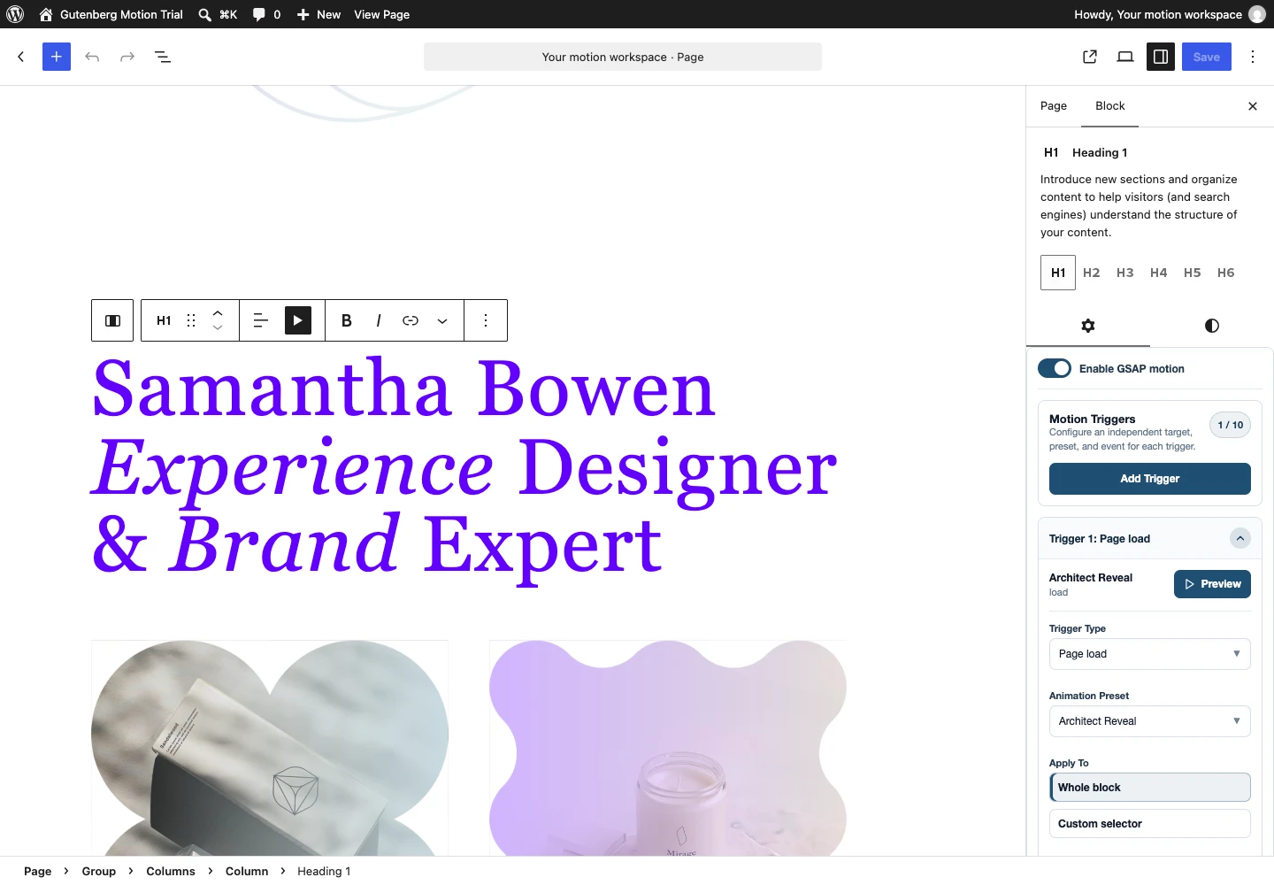
The heading should finish readable in its original layout. If it stays hidden or moves farther than expected, inspect the final preset state and any parent animation before adding more settings. Follow the complete Heading tutorial for split-text choices and a diagnosis table.
Choose targets that match the selected block
Gutenberg represents content with many small blocks. A List contains List Items, Buttons contains Button blocks, and Columns contains Columns. Motion controls follow these distinctions instead of treating every selected block as the same wrapper.
Text and rich content
A Heading or Paragraph exposes compatible text and inline targets. A List can expose its list and items. A Quote can contain several semantic parts. A Table has table, row and cell contexts. Rich HTML content can expose additional supported semantic descendants when they actually exist.
Apply To identifies the content, while Animate As can split compatible text into lines, words or characters. A Paragraph does not automatically contain all heading levels just because those targets exist in a richer context. Likewise, an inline link target needs real links in the selected content.
SplitText supports the splitting workflow; ScrambleText changes displayed characters while revealing the final text. They solve different visual problems. Use scrambling sparingly on short copy and inspect both the final content and its reading time.
Collections and layout blocks
For a Group, use Whole block to move the composition or Direct children to resolve its immediate child blocks. For Columns, inspect the Columns collection. Buttons, Gallery and Social Links have their own supported collection profiles. A collection does not mean every descendant at every depth.
Navigation needs menu-aware targeting, including compatible top-level and submenu choices. A submenu has interaction and focus requirements that a static card grid does not. Keep essential links available on keyboard and touch devices.
Use the List, Button and Column targeting guide before sequencing a nested layout. Custom selectors are for content whose rendered structure you understand, not a default shortcut around contextual controls.
Find, preview and reuse a preset
The current product catalog presents 251 built-in and library presets, including 73 built-in designs. These are not 251 presets all bundled into the plugin ZIP. Built-in definitions are available locally; remote definitions need to be imported or saved to your library before a page depends on them.
- Open the Preset Library and filter by the content type you intend to animate.
- Use the motion-structure filter and search to narrow the designs.
- Preview a candidate and replay its complete movement. A thumbnail is useful for discovery, not a publishing test.
- Edit the preset when you need a different reusable design, or select it unchanged in a compatible placement.
- Return to your block and use its trigger preview on the actual content.
Edit shared presets deliberately
Built-in presets can be edited and saved through the manager. Their reset action restores the shipped definition when needed. Import and export support moving definitions between compatible installations; keep preset identity and dependencies intact rather than manually changing an ID to imitate another asset.
Changes to a shared definition can affect multiple placements. Preview those important uses after changing it. Make a separate preset when one page needs a different design, and use a name that explains the purpose rather than an internal implementation detail.
Create the motion, then test it on content
Choose Create New, a compatible content type and a motion structure. Start with only the properties required by the design. A small translation with opacity can establish hierarchy more clearly than an oversized effect that hides the message.
Simple, Staged or Advanced Timeline?
| Structure | Use it for | Keep in mind |
|---|---|---|
| Simple Motion | A focused transition or interaction. | One coherent animation can still use compatible stagger and easing. |
| Staged Motion | A coordinated parent-and-child design. | The child targets and their timing are part of the reusable structure. |
| Advanced Timeline | Several deliberately ordered or overlapping steps. | The full sequence must have a sensible start, handoff and final state. |
Treat properties as design decisions
Transforms can change position, scale and rotation without reflowing the document in the same way as layout dimensions. Opacity can reduce visual noise, but must not leave essential content permanently hidden. Transform origin changes the point around which scale or rotation acts.
Color, typography and other supported CSS controls belong to the target’s actual rendering context. A property existing in a preset does not mean it is useful on every target. Test the real element, including its theme styles and breakpoint rules, before describing an effect as finished.
Set duration and ease separately. CustomEase accepts an easing curve through the Custom Path control; it changes acceleration, not the element’s spatial path. Add keyframes only when the design needs intermediate states. Replay the entire result before saving.
Build an Advanced Timeline with clear timing
- Select Advanced Timeline and define the opening step.
- Add a second step that follows or overlaps the opening. Use its timing controls to express that relationship.
- Check step duration, ease, target and final properties individually.
- Replay the whole timeline, not only one step.
- Assign it to real content and test with the event that will actually control it.
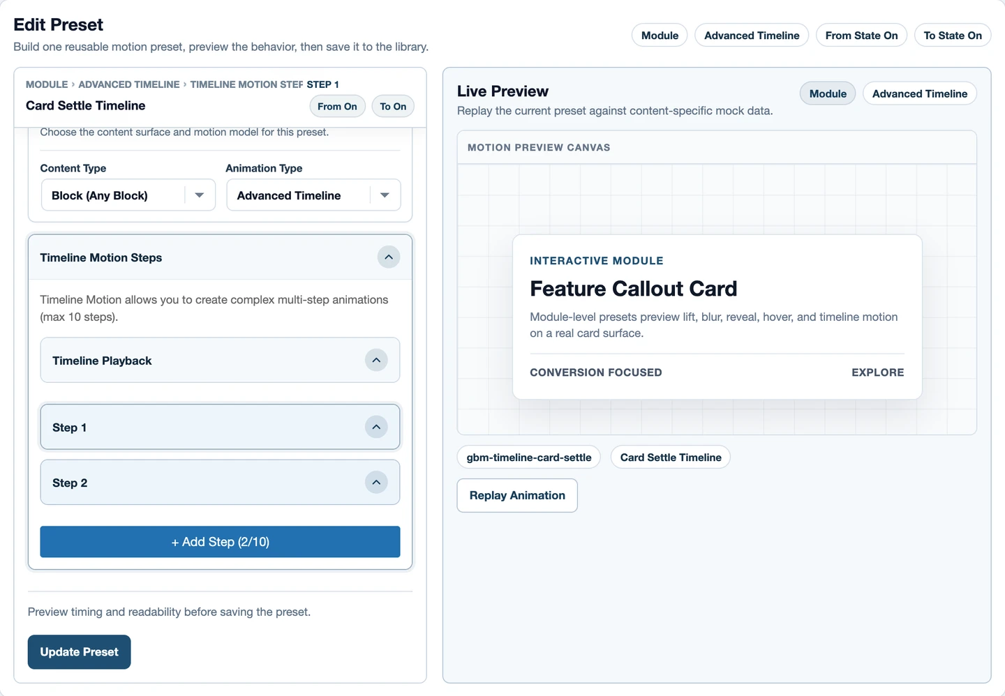
Watch loops and final states
Repeat and yoyo alter how a sequence plays after its first cycle. Step-level timing and whole-sequence playback are not the same decision. Check the boundary between cycles, and avoid persistent loops on long reading text or primary actions.
A scroll-controlled timeline must also make sense at partial progress and when reversed. The full GSAP API includes capabilities beyond this visual interface; do not assume arbitrary callback code or unlimited timeline nesting is exposed simply because GSAP supports it.
Sequence children without losing timing ownership
Preset stagger is part of the reusable motion design. Selected Target Playback sequencing belongs to the page placement and distributes that design across its resolved target collection. Trigger delay is a third choice: it delays playback after the event where applicable.
For three cards, select the parent whose immediate children are the cards, choose a compatible preset, target its children and then inspect the available sequencing controls. If the parent contains only one inner Group, move down to the correct level before expecting three targets.
Combining a preset’s internal stagger with placement sequencing can be intentional, but it increases total time. Always watch the last target. Mobile stacking can make a desktop sequence feel unnecessarily slow, so test the layout at its real narrow width.
Choose when motion runs
The current trigger manager exposes ten trigger families. A placement can hold multiple records, up to ten, but the count of records is separate from the number of available families. Dependent controls appear according to the event, target and preset.
| Family | Typical purpose | Important check |
|---|---|---|
| Page load | A first-viewport entrance. | Final visibility after the runtime starts. |
| Scroll into view | A timed entrance at a viewport boundary. | Enter, leave and back-scroll behavior. |
| Scroll scrub | Progress tied to scroll position. | Start, middle, end and reverse progress. |
| Hover | Pointer-entry or exit feedback. | Touch and focus alternatives; no essential hover-only content. |
| Click | A deliberate interaction. | Normal button or link behavior. |
| Focus | Keyboard-aware feedback. | A visible focus state and readable content. |
| Pointer over block | Movement responding inside the selected area. | Bounds, intensity and touch behavior. |
| Pointer in viewport | A viewport-based pointer response. | Reduced motion and unnecessary movement. |
| Custom event | A named event from an implemented integration. | An actual event dispatcher and agreed contract. |
| Viewport leave | An intentional exit response. | Content remains usable when returning. |
Scroll boundaries are not delays
Start and End compare the trigger source with the viewport. For example, top 80% means its top meets a point 80% down the viewport. Scrub maps animation progress across a scroll interval; ordinary viewport playback runs a timed sequence at a boundary.
Inspect markers while configuring boundaries when the interface offers them, then remove them for publishing. Pinning changes the scrolling layout and needs extra mobile and keyboard checks. The official ScrollTrigger reference explains the underlying model; use the controls supported by the product rather than assuming every API option is exposed.
Multiple records are not automatic conflict prevention
An entrance and a later interaction can legitimately share a placement or occupy separate contextual layers. Two simultaneous entrances writing the same opacity and transform are a different problem. Give each record a purpose, check its event source and avoid overlapping ownership without an intentional design.
Use three different checks before publishing
- Library preview: inspect the reusable definition on meaningful sample content.
- Trigger preview: inspect that definition on the actual selected block and target.
- Saved frontend: save, reload and test the real event on the visitor’s page.
The screenshot shows configuration or a final frame; it cannot prove motion smoothness. Test fonts, images, responsive wrapping and reduced motion on the actual page. Links should work by keyboard and touch. Essential content should remain available when animation is reduced.
For performance, avoid creating intensive split-character effects on every paragraph. Scope movement to what helps scanning and comprehension. Begin with transforms and opacity where suitable, and test costly visual properties rather than assuming all CSS animation has the same rendering cost.
Use libraries and layouts as editable starting points
Browse Remote provides additional definitions with the library’s preview workflow. Save or import a definition into the local library before referencing it on a page. If a placement reports Preset not found, first restore its dependency instead of rebuilding the entire page.
The catalog also provides 20 native Gutenberg page layouts. Gutenberg pages are block structures, not Elementor widget data. A layout import needs the matching builder format and its required presets. Inspect parent and child placements after importing; a child toggle can be off while its parent owns a collection animation.
Replace sample content deliberately. New copy, image sizes and nesting can change line splits, trigger boundaries and child counts. A motion-ready layout is a practical starting point, not proof that every later edit preserves exactly the same sequence.
Keep page transitions separate from element motion
Page Transitions manage native same-site document navigation. Their presets, route rules and participation settings are separate from GSAP element-motion presets. A page transition should not be presented as another trigger on a Heading.
Start with one source and destination, check the matching rule and its priority, then navigate through actual same-site links. A transition preview demonstrates the effect, not whether a route will match. Browsers without the required native support must retain normal navigation.
Check the destination page’s own entrance after the navigation effect. Keep navigation understandable when the document contains many content types and existing GSAP placements. Use the Page Transition guide for the distinct workflow.
Diagnose the smallest failing configuration
If motion is missing, confirm the selected block, valid local preset, target and saved trigger. If it works only in the editor, save first and isolate cache or script-delay behavior on a test page. If content flashes or stays hidden, inspect initial and final values plus competing ancestor motion.
If lines change, check fonts and width. If a collection has the wrong number of targets, inspect direct-child nesting. If a custom event never runs, check its actual dispatcher. Keep a support report specific: product version, WordPress version, affected URL, preset, selected target, event, expected result and observed result. Do not include passwords or full license keys.
Your next useful step
Start with the Heading tutorial, then apply the collection targeting guide to one real section. Browse presets and layouts, or use the editor experience to inspect the workflow directly.
The documentation is the detailed control reference. When the product fits your workflow, review the current plans. No animation replaces clear content, a sensible hierarchy or a usable page; the right motion makes those strengths easier to experience.