Elementor Motion brings a contextual GSAP motion workflow to existing Elementor 4 content and containers. You do not need to replace a Heading, Text Editor or other supported element just to animate it. Keep the page you designed, create a reusable animation, then attach it to the content and event that make sense.
This guide takes you from installation to a saved frontend result. It covers field versus widget ownership, semantic text targets, preset creation, timelines, container sequencing, triggers, library imports and native page transitions. Use it alongside the control reference, not as a claim that every widget from every third-party vendor behaves identically.
Understand the workflow before adding effects
A motion preset stores the reusable visual design. A placement belongs to an existing content field, widget or layout container. It references the preset, chooses the target and decides when playback starts. These responsibilities remain separate so motion can be reused without copying a complete interaction setup.
Field, widget and container are distinct layers
| Layer | What it owns | Typical use |
|---|---|---|
| Supported content field | The actual title, text, image or button content. | A title entrance, text split or button response. |
| Whole widget | The widget as a rendered unit. | A complete card or widget moving together. |
| Container | A layout composition or supported collection of its children. | A section entrance or a sequence of immediate cards. |
Animating the whole widget can affect its content, spacing and visual wrapper together. Animating its Title field addresses that content specifically. Animating its parent Container adds another layer. Choose the owner intentionally before diagnosing a preset or event.
Reuse the motion without coupling it to one event
A hero heading can reference a preset on Page load. A later heading can reference the same preset on Scroll into view. The visual definition stays shared while the placement handles context. A preset edit can therefore change both uses; a trigger edit changes the relevant placement.
That is a practical reason to separate definition and trigger: you can build a consistent motion language without duplicating definitions for every interaction. It does not eliminate the need to check conflicts, responsive layout or valid targets on each page.
Install the correct product for Elementor 4
Use WordPress 6.5 or newer, PHP 8.0 or newer and Elementor 4. The supported Elementor generation is version 4; do not assume compatibility with Elementor 3 or a future major version. PHP Sodium is required for protected commercial services.
- Sign in with your purchase email and download the Elementor Motion ZIP.
- In WordPress, choose Plugins, Add New Plugin and Upload Plugin. Install the compressed ZIP and activate it.
- Open the product’s license screen and activate the Elementor Motion key for this site.
- Open the Preset Library and confirm the built-in definitions appear.
- Open a test page in Elementor 4. Begin with a supported native element whose content and layout are already finished.
A Gutenberg Motion key is not interchangeable with an Elementor Motion key. Keep private license and download information out of public screenshots. The installation guide covers setup and account access.
Add your first animation beside a real field
Start with a Heading so the selected content and result are easy to identify. Set its Title, HTML tag and typography in normal Elementor controls. Confirm that the title fits desktop and mobile before adding motion.
- Select the Heading in Structure or Navigator and open Content.
- Enable GSAP motion directly below Title.
- Choose Architect Reveal, Apply To Whole field and Animate As Elements.
- Select Page load as the trigger type, without extra loops for the initial test.
- Preview this trigger, update the page and open its public URL in another tab.
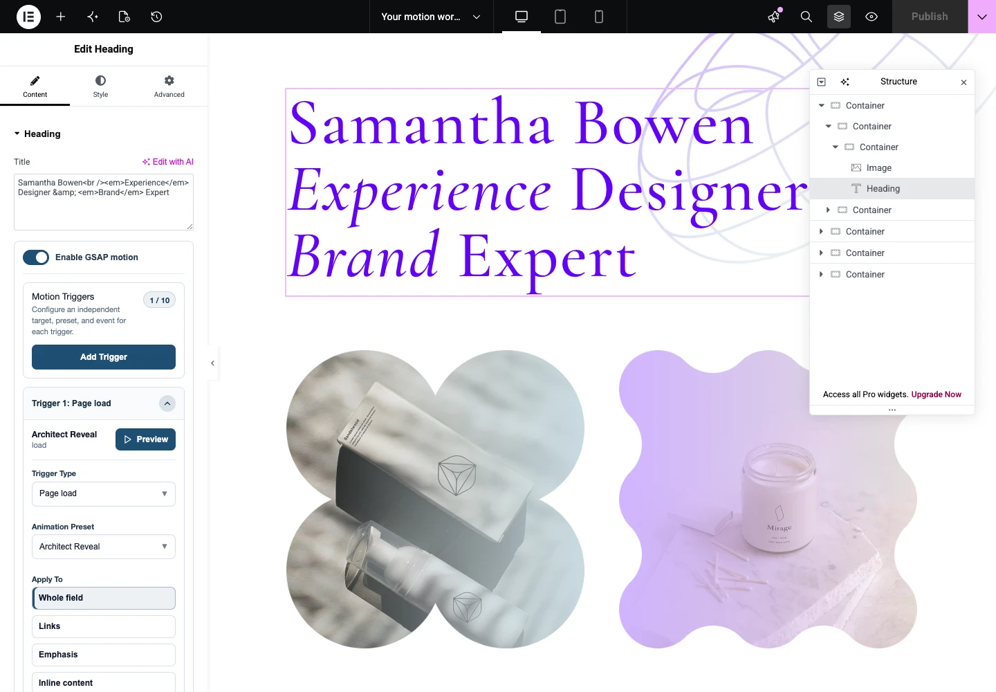
Watch the completed frame as well as the movement. The title must finish readable, not hidden or displaced. The Heading tutorial expands this setup into lines, words, characters and a frontend checklist.
Let the target follow the selected content
Apply To determines which supported content moves. Animate As determines compatible granularity. Trigger On determines which source provides the event. These labels answer different questions and should not be treated as several names for the selected widget.
Title and Text Editor need different choices
A Title field is a small text context. Whole field animates the complete title; compatible inline targets refer to actual links or emphasis. A Text Editor field can contain a document of headings, paragraphs, lists and other supported semantic content. Its choices can therefore be more specific.
If you want only paragraphs in a rich field to move, select the appropriate paragraph target rather than splitting the whole widget wrapper. If you want headings, confirm which headings actually exist. A semantic option does not create markup that the content does not contain.
Lines, words and characters use compatible text splitting. Font loading, width and responsive typography affect line grouping. ScrambleText instead changes the visible character sequence while revealing the final copy. Use either technique for a purpose, not as a default treatment for every paragraph.
Images and buttons should keep their normal behavior
A supported image target is not automatically its caption, link and outer widget all at once. Choose the context that owns the visible media. Preserve meaningful alternative text and avoid effects that make the image difficult to inspect.
For a button, distinguish a collection entrance from individual interaction feedback. Test its link, keyboard focus and touch behavior. A hover response should not be necessary to discover the action, and a click effect should not make navigation unreliable.
Elementor 4 has more than one element structure
Elementor 4 can expose widget and atomic element structures with different field profiles. Follow the actual supported element and native control placement. Do not assume that two similarly named elements, or a third-party widget, share the same fields and rendered markup.
For whole-widget motion, inspect the Elementor Motion section in Advanced. For supported Container motion, inspect its section in Layout. Field controls appear beside supported content fields. These placements are separate records even when their visible targets overlap.
Choose a reusable preset from the library
The current catalog presents 251 built-in and library presets, with 73 built-in designs. The full catalog is not all bundled inside the ZIP. Built-in presets are available locally; additional remote definitions must be imported or saved into the local library before a page depends on them.
- Open Preset Library and select the content type you intend to animate.
- Use motion structure and search to narrow the candidates.
- Preview and replay a design against its sample content.
- Edit it when the reusable visual design needs a change.
- Select the compatible local preset in the actual Elementor placement and preview there.
Shared definitions require deliberate edits
Built-in definitions can be edited and saved, and the reset action restores their shipped values. A shared edit can affect several pages that reference the same definition. Create a separate preset when one use should depart from the common design.
Use import and export to move definitions while retaining their identity. If an imported layout reports Preset not found, restore its required local definition rather than substituting an arbitrary ID. The public Preset Library helps you explore the catalog before opening the editor.
Create a focused animation before a complex sequence
Choose Create New, a compatible content type and a motion structure. Name the result for its use, such as a restrained card entrance or title settle. Add only properties that contribute to that design.
Three structures, three different needs
| Structure | Best starting use | What to verify |
|---|---|---|
| Simple Motion | One focused entrance or interaction. | Initial and final properties, duration, ease and compatible stagger. |
| Staged Motion | Coordinated parent and child phases. | The actual children, phase order and complete sequence time. |
| Advanced Timeline | Several ordered or overlapping steps. | Step targets, timing handoffs and the final readable state. |
Properties need a real rendering context
Transform, opacity, color and supported CSS settings apply to real rendered targets. Transform origin changes the point around which scale or rotation acts. A property that is useful on an image may have a different result on text or a container.
Keep layout design in Elementor’s normal controls. An animation should not compensate for incorrect width or spacing. Prefer restrained movement where appropriate and check any expensive visual property on the actual page instead of assuming every property has the same rendering cost.
Duration is not ease. Duration sets time; ease changes acceleration. CustomEase uses its Custom Path input for an easing curve, not an SVG movement path. Keyframes add intermediate states when the design needs them. Replay after each meaningful change.
Compose an Advanced Timeline that joins smoothly
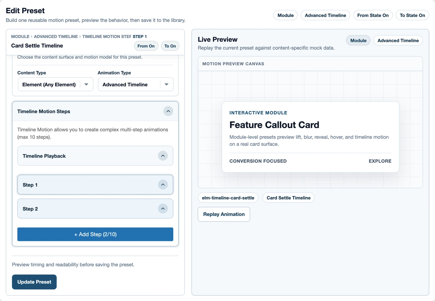
- Create an Advanced Timeline and define its first step.
- Add a following step with a clear purpose, such as a settle rather than another identical entrance.
- Set position and overlap deliberately. Keep duration and ease visible in your decision.
- Replay the full sequence, observing the transition between steps.
- Save and test it on the real field, widget or container with its intended event.
Repeat and yoyo should not obscure the message
Repeating a timeline and repeating an individual step are different choices. Yoyo reverses progress; it does not make every final state appropriate for reading content. Watch the boundary between cycles and avoid persistent loops on essential copy or primary actions.
For a scrubbed timeline, stop at intermediate progress and scroll backward. The design should remain understandable, not rely on reaching the final frame. The visual builder exposes supported GSAP capabilities; it is not a promise of arbitrary callback code or unlimited nested timeline editing.
Sequence Container children at the correct depth
A Container can move as one composition or animate supported immediate children. If its only child is another Container, Direct children does not automatically resolve every card deeper inside it. Inspect Structure and select the parent whose children match the intended collection.
A practical card sequence
- Select the Container holding the actual sibling cards.
- Choose a compatible preset and Direct children target.
- Use a common event boundary if the cards should start as a group.
- Enable selected-target sequencing where applicable and keep the interval modest.
- Inspect the final card, save and check the stacked mobile layout.
Preset stagger remains part of the reusable design. Placement sequencing distributes that design across this collection. Trigger delay adds another time decision. Combining them may be useful, but must be intentional. See the timeline and Container guide for timing ownership and conflict examples.
Choose the event that serves the interaction
The manager currently exposes ten trigger families and supports up to ten records per placement. Those are different counts: the families are the available event categories, while records are the configurations you attach. Dependent controls follow the selected family and target.
| Trigger family | Useful for | Check carefully |
|---|---|---|
| Page load | A hero entrance. | Final visibility after initialization. |
| Scroll into view | A timed section entrance. | Viewport boundaries and return scrolling. |
| Scroll scrub | A sequence tied to scroll progress. | Partial and backward states. |
| Hover | Pointer-entry and exit feedback. | Touch and keyboard access. |
| Click | A deliberate action. | Normal navigation or button behavior. |
| Focus | Keyboard-aware feedback. | Visible focus and stable text. |
| Pointer over element | A local pointer response. | Bounds and motion intensity. |
| Pointer in viewport | A viewport-wide pointer response. | Reduced motion and touch behavior. |
| Custom event | A named implemented event contract. | An actual source that dispatches the event. |
| Viewport leave | An intentional exit response. | Readable content when returning. |
Read scroll settings as boundaries and progress
Start and End relate the trigger source to the viewport. A start such as top 80% describes geometry, not a delay. Apply To identifies what moves; Trigger On identifies the supported source that supplies that boundary.
Ordinary scroll entry runs a timed animation. Scrub links progress to scrolling. Pinning changes how content participates in the page’s scroll layout, so check mobile height, surrounding containers and the content after the pinned area. Markers can help while configuring; remove them before publishing.
GSAP’s ScrollTrigger reference explains the underlying concepts. The product exposes a supported subset; a GSAP API feature being documented does not prove that every form of it is available in this interface.
Several events do not justify several competing entrances
A collection entrance followed by an individual button response can be useful. Two simultaneous records writing the same opacity and transform may compete. Give each a purpose, inspect its source and avoid duplicating the same entrance at field, widget and Container levels.
Custom event selection does not make an unrelated form or commerce plugin dispatch that event. Use it with an implemented contract. Hover also needs a touch-friendly alternative; focus feedback should retain a visible, normal focus state.
Preview, save and verify the frontend
Library preview demonstrates a definition on sample content. Trigger preview uses the selected real target. The saved frontend tests the actual event, page assets and visitor layout. All three have a role; none replaces the others.
- Replay the preset through its final state.
- Preview the actual field or Container placement.
- Update the page, reload Elementor and confirm the record is still on the intended layer.
- Open the public URL and perform the real interaction.
- Repeat at mobile widths, with reduced motion and keyboard navigation.
Static screenshots prove configuration or final composition, not the timing feel. Check the real font, image dimensions and responsive changes. Limit intensive character splitting on long text. Let movement support reading rather than delay it.
Import the asset and its required definitions
Browse Remote previews additional presets, then imports or saves them into your local library. A remote catalog entry is not yet a local animation dependency. If a page reports Preset not found, first check that its required preset exists locally.
The catalog provides 20 native Elementor layouts. Elementor widget and Container storage is different from WordPress blocks, so choose the matching format. Import the page with its required definitions, then inspect its field, widget and parent placements before changing content.
A child toggle may legitimately be off when its parent owns a collection entrance. Conversely, motion on the frontend is not sufficient proof that the editor exposes the saved record at the correct layer. Save and reload several representative elements, then check the frontend again after replacing sample content.
Manage navigation through a separate Page Transition workflow
Native same-site page transitions operate at document navigation, not as another element-motion preset. They have their own presets, participation settings and route rules. Keep that configuration separate from GSAP field and Container animation.
Start with one exact source and destination. Inspect the matching rule and priority, then follow actual same-site links. A transition preview demonstrates the visual effect but does not establish that a route matches. Unsupported browsers must still navigate normally.
Test the destination’s own GSAP entrances after navigation. Existing page content, incoming motion and the document-level effect need to coexist without hiding the page. See the Page Transition documentation for route and participation controls.
Troubleshoot the first failing layer
For absent controls, check Elementor version and the actual supported element. For missing motion, check the local preset, target and saved event. For excess movement, disable competing ancestor or descendant placements and restore them one at a time.
If the editor works but the frontend does not, update first, then isolate relevant caches or script-delay optimization on a test page. If line splitting changes, inspect fonts and width. If a collection has one target instead of several, inspect its immediate children.
Send support the product and Elementor versions, page URL, preset, layer, target, trigger, expected result and observed behavior. A specific small reproduction is more useful than a screenshot of an entire unrelated page. Never send passwords or a complete license key.
Continue with one practical workflow
Follow the Heading tutorial or build a section using the timeline and Container guide. Explore the Preset Library, native layouts and editor experience before adapting a design to your own content.
The documentation is the control reference, and the pricing page explains current plans. The best result is not the most animated page: it is a page whose hierarchy, interactions and message become clearer through deliberate motion.